Logos
The Earl wordmark sits on any of the brand surfaces. Match the wordmark colour to the highlight of the surface it lives on. Never recolour outside the system.
Primary wordmark
The default pairing. Lime on Earl Green for dark surfaces, Earl Green on Lime for light surfaces. Use these two unless you have a reason not to.
On hue surfaces
When a section adopts a hue (pink, purple, blue) for the page chrome, the wordmark moves with it. The rule is the same on every hue: highlight on background-dark for dark themes, background-dark on highlight for light themes.
Cream variant
Cream on Earl Green is permitted for very low-contrast contexts. Treat it as the exception, not the default.
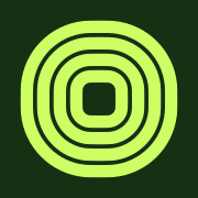
Favicon
The reduced mark used as the browser favicon and app icon. Concentric rounded squares in lime on Earl Green. Three formats are shipped: SVG (vector), PNG (raster, apple-touch-icon), and ICO (legacy fallback).
Usage guidelines
Do
- Use the highlight colour from the active hue for the wordmark
- Maintain clear space equal to the height of the "e" on all sides
- Use SVG format whenever possible for screen use
- Ensure minimum width of 80px on screen
Don't
- Recolour the wordmark outside the brand and hue palettes
- Stretch, skew, or rotate the wordmark
- Add drop shadows, outlines, or other effects
- Place on busy backgrounds that reduce legibility
- Use a hue colour against a different hue's surface